'Career paths' vs 'Programs' - An A/B test
Decisions are based on past experience, user tests, and patterns that we aim to keep consistent across all our sites. Sometimes certain decisions sound like a solid plan when discussed internally and then sometimes these flow externally to the end-users.
When restructuring the College of Education website we decided to use the label “Career paths” as the main menu item in order to navigate to a page that listed the different areas of an education degree. Once an area was selected, it then listed all the available degree options.
This made sense to our team since the entire site was reshaped to address the outcomes and careers of education degrees beyond, but also including, teacher education.
# Getting visitors to programs
Comparing the traffic for a few months between that of the new page and the previous page sparked our curiosity in regards to the effectiveness of the menu item label, “Career paths.”

This graph compares traffic from July 13, 2020, the launch of the new College of Education website, to November 13, 2020, displaying the two versions of the page that lists the programs. Immediately you’ll notice there is less traffic to the blue line (new page) compared to the orange line (previous page).

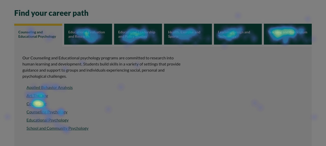
This trend would be very concerning without additional context. The new site includes a list of career paths and direct links to programs from the homepage, something the previous site didn’t have. This creates two ways to access the program list. Through heat mapping, we know about 30% of visitors are using that homepage element to “jump” directly to a program area instead of navigating through the top menu item page to view the list.
# “Career paths” vs “Programs”
We had a hunch the homepage element was working as designed but also the term “Career paths” didn’t exactly provide clarity to what lived behind that menu item. We received this feedback informally from others around campus also, so we set out to test this hunch ourselves.

We set up an A/B test to let our users decide.
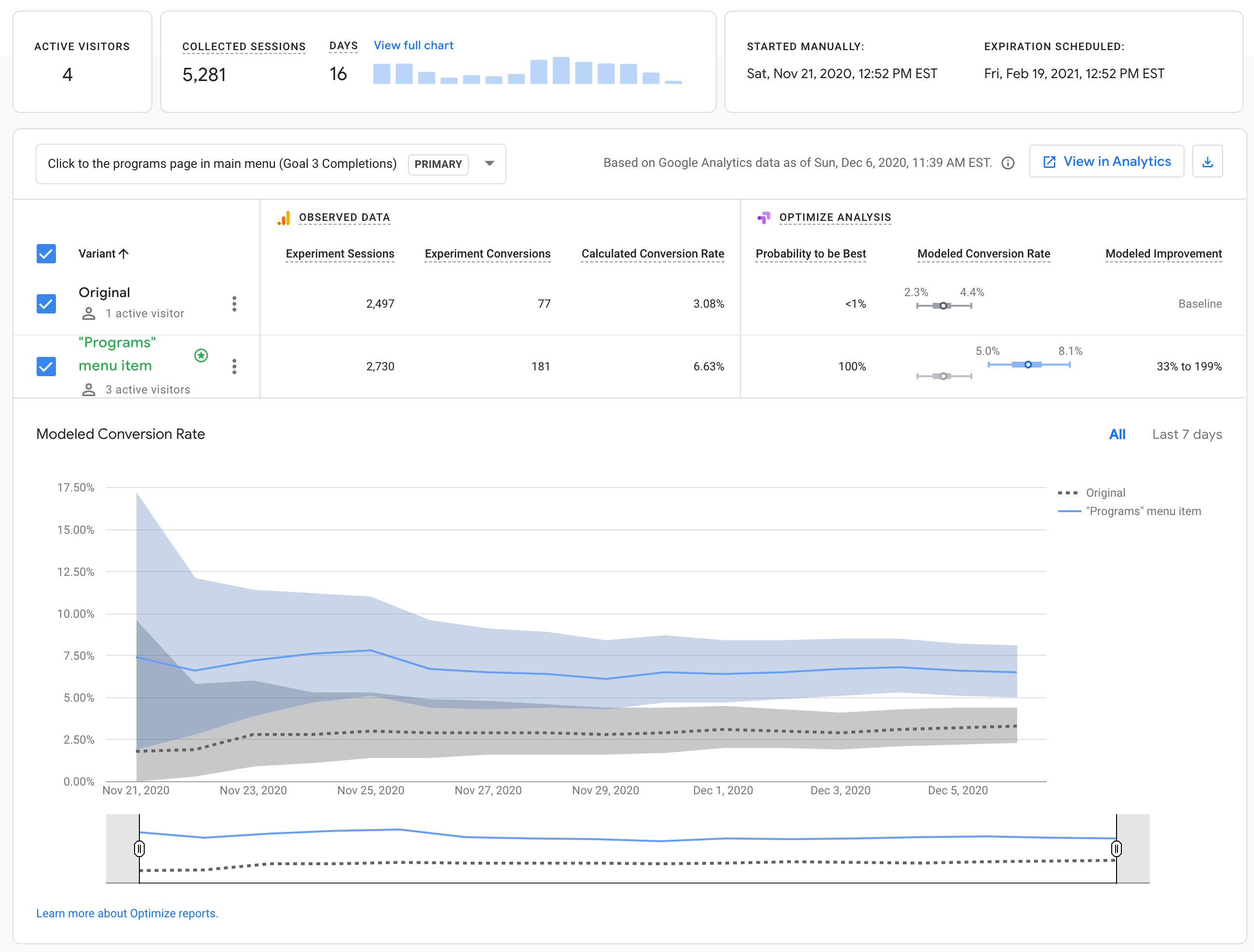
The control was the original “Career paths” label and we set up a test version “Programs” variant. The goal for the experiment was to track any activity directed toward the programs listing page.
We run our tests with as many users as possible and with the amount of traffic to the site and this page, we were confident we would receive a statistically significant result within a few weeks.
# A/B test results

The results were impressive. The “Programs” label resulted in double the number of conversions.
These types of insights are not something a typical analytics tool will be able to report with dashboards or automated metrics. It’s important to consistently listen to feedback, even if it is internal. Questioning best practices or the way things have always been done is the only way to truly know if you’re doing the right thing for your users. In our case here the “right thing” is clarity and we’re happy to continue to provide the information people are looking for as quickly and clearly as possible.